Monday, 7 March 2016
Friday, 26 February 2016


Saturday, 13 February 2016
Monday, 1 February 2016
Evaluation - Question 1
My media product is a 3-5 minute music video which specifies in the genre of soul. The purpose of making a music video has a variety of factors and reasons. Some of which include promoting the artist, promoting the album and telling a story. This is an effective way for the audience to learn more about the artist as they are watching a product which is from the interpretation of the artist and what the lyrics of the song means to them.
 The soul genre includes a lot of things to make it conventional to soul. These range in all different types of micro-elements to portray a deeper emotion of how the artist is feeling towards its audience. A prime example of a music video which is conventional to the genre of soul is Amy Winehouse, 'Back to Black.' This music video withholds a lot of emotion and sadness which the audience are immediately able to pick up on. An example of a conventional element included is filters. The finalised music video was edited to change its original filter to a black and white effect. I thought this was extremely successful as it conveyed to the audience a sad time due to the dull tone the monochrome filter uses, which is the death of one of the artists loved ones. Using this filter, allows the audience to watch the music video in a gloomy, depressing manner due to the little colour it represents. Using this filter was effective for the genre of soul as it portrayed a sad and depressing time. The dull effect allowed the audience to understand the particular emotion which the artist and character is experiencing. The filter allowed a mood set for the particular scene. This monochrome filter was evident within my music video in the flashback scenes. The flashback scenes were used so the audience were able to learn more about the artist and her experiences with romance and how she reacts towards it. The scenes include the artist, Cara-Lily and her current boyfriend at that time on a date walking around at the park, to then having a romantic night in having a meal. The audience are able to see how she reacts to someone paying attention to her and flirting with her. Using a monochrome effect allows the audience to understand that this is a past related time, as it can relate to the 60's generation when there was no colour towards any tv programmes or media entertainment. This can show the artist and her boyfriends current relationship is now non existent, and that is why when they are together, it is only now in the monochrome effect to show it is all in their memories and past now. An example of this being used within my music video is when they are by the dinner table drinking wine and eating food. The boyfriend is shown to be constantly looking at the artist and trying to make her laugh. This was purposely used to show the boyfriend as interested in her and wanted to pursue her happiness. The artist is shown to be looking quite careless and disengaged in the whole situation. This is shown through her facial expressions of eye rolling etc. This then also links in well with the use of filters as it is showing a negative approach and experience.
 Another micro-element which was used within Amy's music video which relates to the soul genre is camera shots of close ups. This type of cinematography is effective as the audience are able to witness the artist in a vulnerable state. The audience are also able to see her emotion of sadness in high definition, with extreme detail. This type of detail wouldn't be seen in camera shots such as mid shot or low angle. This is conventional to the genre of soul as the artist is able to express sad emotions which the audience can quickly see. As the audience are aware of the type of emotion trying to be portrayed, they can then sympathise for the artist, as they feel sorry for her as she is in a negative situation at that time. The audience are then able to build a relationship with the artist as they recognise her vulnerability. This is important to do as it is showing her sad emotional state, which is conventional towards the genre of soul. Close ups are used numerously within my music video to allow the audience to become more aware of her facial expressions and smudged make up on her face to represent her wild life style. Using the camera shot of a close up is conventional to the soul genre as it represents the exposure to her life due to opening up of her emotions. However; it is subversive from the way I was trying to represent the artist. I wanted the audience to look into greater depth and definition/detail towards her recklessness and careless. This was shown through sloppiness of looking after her physical self, such as left over, or old makeup, and not caring as long as she can carry on partying and drinking. An example of this being used within my music video is when she is shown to be in her bedroom in the morning drinking. Using a close up for the scene of her drinking as soon as she woke up was effective as the audience were able to see the artist in her true state. Her hair is frizzy and unbrushed, with her makeup of mascara and lipstick smudged all over her face and neck. This shows her to have little care towards her appearance and only wants to do whatever she wishes, in this case she is drinking. Using a close up allowed the audience to witness the non-existent happy expression she has upon her face before, during and after drinking from the bottle. This shows a very negative addiction she has towards alcoholism and how it is not making her genuinely happy, more like a cover up towards how she really feels. This then conforms to the genre of soul as the audience are able to understand how she is feeling due to the vulnerability she with holds.
 Locations are shown throughout my music video to show towards the audience where my artist enjoys to go out in spare time, and places she will end up at. The audience are able to learn more about the artist from which scenario they are at, this can then build a relationship as they are learning more about her persona and characteristics. Locations are effective as it enables the audience to learn more about the situation. An example of this being used within my music video is during the flashback scenes, when the boyfriend and girlfriend at the time are on a date together. The audience are able to build a relationship with the artist as they are learning more about her, due to Cara-Lily opening up about particular and personal experiences of her own. The couple are shown in various scenes to be walking around in public together, being very affectionate such as holding hands. They are also shown in another date scene having a romantic and intimate meal together. This is conventional to the soul genre as it is showing the artist on a highly emotional level. She is shown to be sharing experiences with her fans, which they can then admire and appreciate, and are able to then build a bond with.
 Facial expressions are used all throughout my product of a music video. Including a variety of facial expressions allow the audience to understand how the artist is feeling in a physical manner. This represents the artist as vulnerable as she is shown to be opening up about all her emotions towards a wide spread audience of viewers and fans. Facial expressions can be conventional to the soul genre as it can show how and why the artist is feeling some sort of feeling. The audience can then feel sorry for the artist and are then able to build a bond with her, which then helps to build a relationship with one another. An example of this being shown within my music video, is during the bedroom scene. There is a close up of the artist looking down whilst holding onto the door frame of her bed. She is shown to be deep in thought, which the audience are immediately able to acknowledge as she is shown to be disengaged and uninterested in present events because her mind is elsewhere. The audience are then able to understand how she uses alcohol to hide her emotions, but cannot always hide how she feels. In the bedroom scene, she is shown to wake up, and as soon as she gets out of bed to start drinking wine from the bottle. People drink alcohol so they can feel a type of way, which people can thrive off of as something else is controlling your mind and brain. This then opens up peoples emotions that the artist was so desperately trying to hold in. This is conventional to the genre of soul as it is showing her emotions towards the audience. She is shown to be upset and hurt, which is conventional to soul as she is showing her emotions towards the audience. The audience are able to build a bond with the artist as they are able to witness her in a vulnerable manner, and are able to feel sorry for her. I wanted my artist to represent herself as a very open and say it how it is kind of person, which would be then evident upon mainly her facial expressions and also body language. In this case; in certain scenes, my artist could be shown to be challenging the conventions of soul as she is shown to be uninterested and careless. This can be shown in the date scenes where she is shown to be not too into the whole thing shown by rolling her eyes and looking away from the boy in discomfort.
 Slow editing is used to represent a sad time. Allows the audience to understand in more thorough detail this sad time as a certain scene of sad emotion or telling a story would go on for longer than using fast editing. This is conventional towards the genre of soul as the audience are able to take into more consideration the sad and emotional time due to the longer duration than normally. It allows the audience to understand the artists current emotion. The long duration also allows the audience to take in greater depth how sad the artist is feeling, which they can sympathise more for. The long duration can also show to the audience how this current emotion is staying with her for a long time, showing how it is eating away at her and causing a negative effect upon her. Using slow editing also shows a link between the soul beat of the song. An example of this being used within my music video is in the walk of shame scene. The artist is shown to be walking along the bridge looking around her surroundings, also with a wine bottle in her hand. I used the slow motion effect from Final Cut Pro X to by 50% to create an effect which would fit well with the particular timing of the song. I thought using this was effective as I included it in the part of the song where the lyrics are "Everything is slowing down." This relates towards Goodwin's theory of reference towards song and notion. You are able to see a link between visuals and lyrics, which helps to make a successful artist and music video. This shows a development towards conventions of soul as it is showing an emotional time for the artist. The sad emotion could then become relatable towards the target audience of 15-25 year olds as these ages are stereotypically known to go through 'mood swings,' which then makes it inevitable for them to experience a sad or painful emotion. This music video can then become relatable for them, which then shows what this music video will then mean towards them on a more personal level.
 Costume is used throughout the duration of my music video. Costume allows the artist to represent herself how she wishes to be perceived in a physical manner. An example of this is where the artist is on the walk of shame scene, wearing all black to show respect towards recent passing but also representing the artist herself. Black represents her as mysterious due to the dark tones it represents. This can be shown as a negative thing as she can be perceived as dangerous. Audience able to build a relationship with the artist as they are learning more about her reckless ways. Although, her outfit is shown to be appropriate as she is wearing a long, black trench coat, she can still be perceived a voyeuristic. This can be conveyed through flesh of legs on show and wearing high heels. Cara-Lily is wearing a short, tight black dress showing lots of skin being revealed, she is also wearing high heels which interfere with her balance which is exaggerated due to her intoxication with alcohol. This is subversive to the soul genre as it is showing her to rebel against societies rules and expectations. This challenges conventions as female soul artists are stereotypically shown to be sweet and innocent which then emphasises the audiences sympathy towards her hurt after going through a painful experience, such as a break up. Having a lot of her skin on show can represent her vulnerability towards her viewers. She is opening up about her personal and emotional issues to a large audience. This shows how she is real towards her fans and is not putting on a front to make herself look better, she opens up to positive and negative moments in her life which make her a successful and respected artist.
My media product of the music video develops and also challenges the genre of soul. I purposely done this to represent the artist (Cara-Lily) as far more extraordinary and different towards other female soul artist, this relates towards Goodwin's theory of what makes a successful artist. Involving a range of subversive and conventional elements allowed the music video to feel more refreshing towards its audiences rather than boring. This way, my target audience (15-25 year olds) can feel more edge towards what is going to happen next instead of knowing due to all soul music videos being the same. This then makes them want to watch on more and look at other things the artist has to offer.
A development of forms and conventions in my music video is use of filters, this is used all throughout my music video, but obviously shown in the flashback date scenes. These scenes are shown in black and white, which was inspired from the "Back to Black" music video by Amy Winehouse. I thought this would be effective to use as it can show a past related time, as olden days did not have colour. An example of this being used is when the couple are on a date and are sitting closely to each other on a bench while watching the duck in the pond. Using these filters also emphasise on her life in the past and how much she has changed now. How she has someone who truly cared for her but lost him as she was too selfish and now gets rid of her pain by constantly drinking from when she wakes up in the morning to late at night. This is highly effective as it represents her reckless and party girl character.
Another element which is conventional to soul is slow editing. I used this to match the song lyrics which repeated twice "everything is slowing down." This was effective to use as it showed a relationship between the lyrics and visuals. This is shown in Goodwin's theory of how to make a successful artist. Using slow editing can represent the artists emotion of pain and sadness when you are feeling hurt, everything seems to go a lot slower juxtaposing to saying 'time flies when you have fun.'
An element which is included within my music video which can be perceived as subversive to the soul genre is costume. Throughout the video, the artist is shown to be in various types of inappropriate clothing which can represent her as voyeuristic. This includes clothes such as pyjamas and short, tight dresses. This can represent her persona as careless and very much a party girl who only wants to have fun. This is subversive as she has minimal amounts of clothes on throughout the video; whereas, other female soul artists do not. Other artists are shown to wear things such as coats to fully cover themselves up. This can also show the weather at that time, which is miserable, cold and rainy. This helps to set a mood of sadness throughout the music video and therefore, conform towards the genre of soul.
Thursday, 28 January 2016
Individual Digipak - Miss Miller
Here is my individual digipak. The purpose of a digipak is to present CD singles or special editions. Digipaks typically consist of a grate fold, like a book style, which has the texture of paper boards/ cardboards with some outer binding. They normally have high quality images, and usually contain a letter or note from the artist themselves, which makes it seem more personal for the fans of the artist making them want to buy it. This is something that I produced as a form of advertisement towards the artist and her album. This was an effective piece within my opinion as it allowed the audience to get a feel and an insight towards the persona of the artist. There are a range of different photos with different types of information within each page which allow the audience to learn more about the artist. The pictures include her in different scenarios, such as performing, on a date and on a walk of shame. The audience are able to learn more about her as she is showing things she gets up to and enjoys doing in her spare time. These things include drinking alcohol, shown through the use of wine glass and it spilling to show how much she is under the influence that she cannot handle how to stop spilling things. This can also show how much of her life is out of control, she is spiralling out of control, metaphorically shown through the liquid of the alcohol. Another thing shown within the digipak which she takes part in is her on a date with a boy. The photo is a clear representation of the whole duration of the date as she is shown to look disinterested and bored, whilst the boy is awkwardly looking at her as he is unsure how to impress her. She is shown to be very careless and looks like she is in thought about anything else she would rather be doing, such as partying. The audience are intrigued towards why she is looking so bored towards the situation, which can cause them to purchase the digipak due to curiosity. The digipak does not give too much away, but enough for the audience to understand the genre and mood of the album due to dark colours and edited grey style tones, and also the characteristics of the artist. In order to complete this digipak, I used the software Photoshop CS).

The front cover is the most important page out of the whole digipak, as it is the first thing the audience see. If it is not effective, it will disengage the audience immediately and will make them not want to even bother looking at the rest. The image is extremely important as it is the thing which is taking up most of the page, as it is the background. This image was used for the first page of my digipak, which would be the first page the audience would see and create a first impression upon. I liked this picture as she is shown to be very focused on a certain thing, which we cannot see while she is performing. It is clear that she is performing due to iconography used such as microphone and its stand, also the setting of the stage curtains and how the artist is dressed, in a elegant off the shoulder black dress, half of her hair clipped back with the rest had time taken in by using a curling wand and also use of makeup which highlighted parts of the artists facial features such as lips and eyes, whilst also structuring her natural facial features to look more narrow and bronzed. I wanted the first page to show the artist looking very attractive, which can intrigue audience towards looking at the rest of the digipak and then listening to the album. The artist is shown to have a very straight face whilst she performing, which can covey to the audience that the song she is singing is very serious to her. This can appeal to the target audience (15-25) as they can feel intrigued to know what kind of emotion the artist is going through.
I only wanted to use an image with only the artist in, to represent her as a solo and independent artist, and also showing the importance of her towards the album. Using additional characters in the first page can confuse the audience as it can portray importance to them within the album and the impact they create, however; this would decrease the portrayal of her careless persona, as she would be shown to be with people she cares about. This shows then that she is not a heartless character which takes away any emphasis of her being an extraordinary and different character to the typical female soul artists. I like how the edit emphasises her face shape such as defined cheek bones, which is seen to be an attractive. I wanted to use the black and white edit as it was conventional towards the soul genre. Also, as the colour black is seen as very mysterious and white is seen as very bland, not much is given away to the audience which can intrigue them towards listening to the album as the front cover is almost like it is teasing them. I admire how the use of editing is shown immediately to the audience. You are able to instantly tell the mood set from the black and white colouring which is conventional towards the genre of soul. The mood conveys a a sad, upsetting time, due to the low saturation and no bright lights it produces. I used the eraser tool on the Photoshop software to erase the black and shite edit upon the lip to hangs it back to its original red colour. This is effective as the audience are quickly able to see this as it stands out from the full colours as it is bright and vibrant. The colour red is usually shown to be a sign of danger due to its relation to blood and death. This interpretation is effective as it can portray her personality through use of colour. She can be know. As quite a dangerous character due to her wild ways and hard core party lifestyle.
I wanted to include miminal text within this page so that it wouldn't seem so overwhelming towards the audience. I wanted to keep it simplistic to then engage the audience to read on more within the other pages. Within the text, I did include the artist name and the title of the album in large font. I also used it in the colour white to match the grey and white theme to keep it simple without it looking too colourful and tacky. The white colour complimented the before colour of the dark curtains, which made the editing of it become a mid to dark tone grey colour. I wanted the artists name in a larger, more bolder font to make it stand out more to the audience and then has more of a reliability to stay in the audiences mind and leaving her not to be forgotten about. The album name 'your girl,' I wanted to have a different font to represent what the album is about. I used hand writing like font with the letters joint to suggest a girly album. This is then conventional towards the genre if soul as it can almost portray the album is about 'girl talk' and 'girly gossip,' the topics involved would be boy trouble aswell, which is what is involved within the song. This can intruige the audience towards looking more Ito the digipak or purchasing it as they wish to find out why their is some sort of boy trouble going on. This represents the subtlety the front page presents.
I like how the audience are able to see the quiff on the artists hair, which shows inspiration from our chosen artist of Amy Winehouse, as that was her signature style. I think the facial expression she is making is extremely effective as it shows her disregard towards everything and is completely getting in the zone within her music. This shows her dedication towards her career and how seriously she takes it. This can then relate to the hidden message of her being an independent woman and not living for men, as she will only get her heart broken, which is why she is so careless and rebellious. This is subversive towards the genre of soul, as female artists are typically shown to be heart broken over someone they loved who did not care for their feelings. This shows my artists to be an extraordinary and different artist, which can be refreshing for audiences and idolising for young girls to stay strong and do what you want to do in order to be happy.
Throughout the album, Cara-Lily teaches audiences that you should live for yourself to be happy and do not care what anyone else thinks, and I think using this image is a good way to start of the overall meaning of the album. I wanted to use this picture for both my magazine advert and my front page of my digipak as i wanted to show her in a physically good looking way. The photos where she is performing at a jazz scene is where she is looking most attractive with her hair and makeup done nicely and also wearing appropriate yet tasteful clothes. Using this is conventional towards the soul genre as she is perceived as sweet and innocent. I didn't want to go straight in with her actual persona and overwhelm the audience with her wild actions as it can portray her as easy and 'trampy.' Using this photo can appeal to the audience as they can wish to learn more about her as they are physically attracted to her. Young girls may wish to want to see more of her styles and trends so that can be inspired and copy their idol. Boys can find her attractive and want to hear the album to match a voice to their celebrity crush.
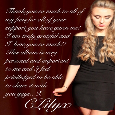
The second page is the written message by the artist. I like this page as it is the most personal thing by the artist towards her fans. She is shown to have written a complimentary message towards how grateful she is towards the loyalty of her fans, followed her by signature to represent and reassure the audience that it was by her and someone who works for her such as her publishers. I wanted to use this picture as I thought be an effective way of showing the artists physical appearance of facial expressions and body language into one of the pages. Within this picture, she is shown to be dressed nicely on a stage ready to perform. She has her hair in a quiff with curled ends and makeup to define facial features such as her eyes and lips. I wanted to include this as it looks conventional due to the sadness it portrays. She is shown to be looking down to the floor, which can show she is deep in thought about something serious and sad. She is not shown to be positive with a smile on her face, but with a very bland expression.
This page presents the most use of language throughout my digipak. This then emphasises how much the artist adores her fans as she is going out of her way and taking time out of her busy schedule to send a grateful message to her fans. I used the same font as I did on the first page for the album name to ensure the pages of the digipak flow together and can relate to one another. I thought this font would be effective to use as it mimics handwriting, giving it a very personal touch and made it seem more life like and real. This font also made it come across more girly an dp friendly, which can appeal to the audience as they do not then feel as intimidated by an independant woman like herself.
I liked how she is shown to be performing due to the type of dressed up clothing she is wearing and the stage curtain behind her. The fact that she is holding the curtains whilst being slightly inside of them can convey a sense of suffocation as she looks like she is about to wrap the material around herself. She could feel mentally suffocated due to the big crowd watching her and her feeling nervous due to the personal songs she is about to sing. This shows her in a vulnerable state, which is conventional towards the genre of soul as it can make the artist feel sad and small, rather than smiley and confident. I wanted to include this certain image for the personal message page as it seemed more passionate. I thought the more vulnerable she seemed, the better as it would seem then more personal and intimate as she is also sending a message towards how thankful she is of her fans. The image of her looking sad can allow the audience to visualise an interpretation of her getting emotional whilst writing the speech. This can then build a relationship between artist and audience as the audience start to believe this bond is more personal and exclusive rather than just watching one of their music videos. The artist is acknowledging the audience and personally thanking them.
I wanted to include an image where most of the artists body is being shown as I thought it would fit well with the text being written around the natural curves of the artists body. I thought this would be more effective than using a close up for the background or it would mean that it would cover the whole background and the text would have to layer over the artists face, which then could make it seem hard to read and then ineffective. For the edit of the image for my digipak, I wanted to make the artists seem more bright, which is why I made the curtains more of a darker maroon, red which then made it easier for the white text to be read. I wanted to use this photo for this particular page where it is most personal, as she is looking down which can show she is deep in thought, leaving the audience to interpret that this is because she is thinking about what to write within this personal message. Including a picture of her allow the audience to fluently visualise how she physically looks if she was to say this message aloud. This can appeal to the audience as it then feels much more personal and raw than just using something boring like a black background. I also like how the writing fits around the figure of the artist, making it the page flow more and making it look more effective.
I used photoshops editing technology to highlight the importance of the the artist. This was sided through darkening the exposure of the red curtains, to make them more of a darker red. Then using the eraser tool to edit it out within the artist. This was effective as it almost gave a glow upon the artist, making her look less normal and more extraordinary and iconic. For this page, I did not have. Any weaknesses whilst using the software, however, would be careful when I was using the eraser tool to ensure it looks effective and not out of line and wonky. If I was to not concentrate upon the eraser, it would make it look less official and effective.

The third page is the display of the appearance of the disc. I extremely admire the colouring from editing I have included within the cd. I wanted to keep it dark to relate to the theme of a dark and sad time. I then used the saturation and exposure tool to play around with what I suited the most. The original picture had things in the background, but I completely blacked it out in order to solely focus on the artist. I like how the image of the artists outline almost blends in with the black. This is highly effective as it can have a range of interpretations, such as she is in a dark place right now or even more extreme towards the darken is eating her alive. Her pouting can suggest that she can trying to put on a face that makes it seem like everything is ok, as she cannot fake a smile.
The writing and typography extremely simple. I wanted to keep the disc display very bare with hardly any writing or too much going on in the picture as it can ruin the element of surprise for when fans listen to the song. The dark colours can suggest negative interpretations to the audience which can be an subtle hint and insight towards what the songs are going to involve. I like how I have placed the album name of 'your girl,' on the opposite side to the artist so it is sitting on top of the black background. I think the juxtaposition between the white writing and black background meshes well and it also makes the writing stand out more. This then allows the audience to be more aware of the album and what it has to offer. I decided to keep the font as the other pages in order to keep it the same and in relation to each other. The white colour kept it simplistic and able to stand out more.
A difficulty I had when producing this page was trying to create a circle shape in order to make it realisticly look like a disc. I tried creating a disc like shape on my own by using the shape tools within the photoshop software, however was unsuccessful as it wouldn't let me layer things such as text and pictures for background over it. This then meant I had to find another way or source to make it look like a disc shape. I ended up researching it on the internet and finding one which I liked which I would them drag to my desktop then drag onto the software. I was the. Able to creating multiple layers which I thought would be most effective within my perspective.
This is subversive to the genre of soul as the artist is usually shown to be devastated over a situation, and has low self esteem, always crying and more. This picture shows her to be confident, which audiences can admire due to her careless attitude towards everything. This is a good way to show her personality through pictures as it shows her to have full self esteem, and feel good in her own skin, the audience can admire this and can also encourage them to feel good about themselves, as fans are idolising her and wish to be just like her. This can show a sense of positivity she is providing towards audiences. I also liked this picture as she is shown as very girly and attractive, I like how the type of harsh lighting shows the shadows of the artists long eyelashes, which audiences of girls can idolise, as the target audience age range (15-25 years old) of girls can be very insecure about certain aspects of themselves, and there are things out as products such as eyelashes which are longer versions of your natural eyelashes, which make your eyes seem bigger, brighter and more attractive. As the shadows make the eyelashes look even longer can leave the audience in lust towards them and can interest them in watching more things of her such as music videos to see more about her makeup techniques so that they can copy the trend. Using the artist which is attractive within the music video is conventional towards the genre of soul as female artists are shown to be pretty which make the audience sympathetic towards them when they are shown to be sad. I also like the warmth of the artists skin tone. I know its important to show a sense of sadness to make it conventional towards the genre of soul, however; I think using a warm, tanned flesh tone can make the audience feel more welcomed and comfortable to watch and listen to the rest of the album. I then made this page more conventional to the genre by making the whole background black, which then highlighted the artists importance towards the music the disc includes. I liked how the image was a bedroom setting, which can make the audience believe it is more personal and intimate, as it is showing a room where she does most of her chores, makeup and hair routines and more on a daily basis. The audience are able to learn more about her as a character, as they are able to see what kind of trends she likes. The black and white themed room then sums up her personality as dangerous and rebellious. I wanted to keep this disc as simple as possible so it did to look so overwhelming. I think the black background d is effective due to how it is almost meshing in with the outskirts of the artist. This can appeal to the audience are they are able to understand what kind of music is going to be played within the disc, which is interpreted from the display as sad lonely and a dark situation which is eating her alive. Her eye shut can leave an interpretation that it is all becoming too much for her and she can no longer handle it. However, her pout can suggest that she is putting on a brave face and is trying to be as calm and collected a a possible, leaving her to be known as careless.

Here is a photo I decided to include within my digipak. I decided to use this single photograph created from my photoshoot to show the relevance to alcohol throughout the album. The audience are able to learn more about the artist instantly as she is then shown to be a regular drinker, or maybe this is one of her hobbies. The audience can also interpret that she has a addiction with this substance due to her using alcohol as a form of pain relief and a way to forget about the pain.
I think the colouring within this photo is very effective as it can represent a lot about the character. The background looks like crumbled up paper which can be a symbol of the artists messed up life. The colouring also looks old and worn out which can be a representation of the artist, as she is so use to dealing with people treating her bad that she does not know how to react when someone comes around who is truly inlove with her. The off colouring and crumbled texture can also interpret the artist as 'broken goods,' as she may look attractive on the outside but is mentally broken, causing her to react in a careless way as that is the only way she knows without getting hurt. I decided to use the colour of red wine to show the variety of alcohol she drinks, to show she is not fussed as long as she does not feel sober. I also think using the singular colour of red can show a sense of danger, which also then shows relation to the first page of the artist wearing red lipstick. The red coloured drink can show her to refer back to the saying 'you are what you eat,' but in this case drink (she drinks her carelessness and heartlessness.)
I did not include much editing within this page on Photoshop as I wanted to keep it simple. However, I did put highlights upon the wine glass and the surrounding of the glass to show the importance of drinking towards the artist and the album. You are able to see this editing techniques at the edge of the page, as it is shown to gradually get darker. This was not difficult to complete as I would play around with brightness of the picture and then use the eraser tool on the soft brush and a large size to make it seem natural and purposely meant to be there. I did not want to use any text within this page to how the importance of alcohol and only that.

I wanted to include this photo to show a sneak peak towards one of the albums music videos. The audience are able to see the artist on a date and how she is reacting to that. She is shown to be disinterested and engaged whilst the boy is shown tone eager as he is lustfully looking at her when she couldn't care less. I wanted to include natural lighting within this picture to show the realness towards it. I also thought that the natural lighting captured the importance of the artist as the light reflects down on her along her seem brighter than the boyfriend, also because she has naturally long light hair and wearing light clothes whereas the boy has dark coloured hair and clothes on. I again didn't want to add any text towards this page so the audience are able to completely focus on the two on the date and the awkwardness of it. This page was probably the easiest to complete because once I had chose which one I wanted to use, I then didn't need to add any special effects towards it as I wanted to keep it as natural as possible, almost like it is a memory snap, something someone has seen and has captured in their memory due to it being awkward and that is how they remember the whole situation. It is almost like the audience are seeing it in the 3rd persons perspective, making it then seem more personal which fans appreciate, allowing a stronger bond to be formed.
I decided to use this specific picture which was also shown in a similar way within pne of the music video scenes. I decided to include this within my digipak as I thought it was the most effective way to sum up her character. I think this picture shows a thousand words and allows the audience to immediately understand her personality more clearer than showing another action shot of her performing at the jazz bar again. This also gives the audience an insight towards the album without giving too much away. If you was to look at this page without hearing the album first you would instantly react with her being one a date with a good looking boy, who is clearly into her from the way he is looking at her in lust and her obvious reaction of looking bored, frustrated and showing no kinds of affection towards him. This then highlights her overall persona me and my group wish to accomplish which is careless. You are able to tell her mind is on other things and not the date she is currently having, the audience are unable to tell what this is which make them want to purchase the digipak and not all has been revealed but a tasteful amount. I didn't include much editing towards this as I wanted to make it look as natural as possible, from the lighting of bulbs already used when taking the photograph. I wanted one of the pages to tell a story to the audience to make it seem more like a real life situation instead of a planned photoshoot. The audience are able to build a bond with the artist as they are learning more about her behaviour and ways of how she treats people who care about her. The audience are then intruiged to find out more towards this situation as to why she feels this way and what happens next, leaving them listen to the album. As the target audience is 15-25 year olds, and they are known to be most interested in other peoples personal lives and to gossip, using an image like this is extremely effective as it allows the audience to briefly understand what's happening within the situation, but will only find out the whole story if they listen to the album. This intruiged the target audience to purchase the digipak as they are curious a to why this scenario has occurred.

This is the page which includes the most information about the album. It shows to include a variety of song names within the album. This is the back page of the digipak which is evident through the scanner at the bottom right of the picture. This was an effective touch as it made it look more professional and realistic, something you would actually see in a shop.
I wanted this page to relate back to the first page of the digipak to make it seem like all the pages add up and stay in relevance even if they include different scenarios and emotions. This was completed by using the same background scenery. This was from the jazz bad scene with the same curtains in the background. I was going to use a black background but then I tried it but did not look as effective. It made it look like I didn't put a lot of effort towards it and also made it look irrelevant towards the rest of the pages as some pages are dark but not completely black. I think also using the colour red was effective as it represented her as a character. Using varieties of red throughout the digipak allow the audience to get a glimpse towards how she wishes to be portrayed throughout the albu,much is dangerous and naughty. Using curtains can also represent a range of connotations leaving the audience to question as to what is behind them. Leaving it to the last page give the audience an overview that in order for all to be revealed they have to purchase the album. The artist will reveal her true self throughout the duration of the album. This is a sucessful and effective way to lure the audience into buying the album as they are curious.
I kept the colour of the font the same to ensure it stands out from the dark red background. This allows it to stay clear for the audience to read the song titles to try and get more of an understanding towards tpwhat the album portrays. I didn't want to use the handwriting font as I thought it looked less professional and can then be more difficult for all viewers to read. This shows the seriousness of the album and that is legit and not something just thrown together. I again, chose to include the album title in a larger font to make the audience more aware and can help them to easily memorise it. The bold font also benefits this.
I think my digipak conforms to the genre conventions as it is clear to see the artist is sad and in a dark place. The uses of dark colouring and serious faces are conventional as it shows her to go through a negative experience and leaves her feeling lonely and sad. However, there are some conventions which adhere to the soul genre to show the orginality of the artist and how she is different to every other soul artist. Some of these conventions include using colours of red which can show elements of danger, and female soul artists are suppose to be percoeved as innocent, which then makes it easier for audience to sympathise for them as the audience almost believe they do not deserve the pain that has been brought to them. This artist is also shown to be drinking from the time she wakes up, to late night hours, which can portray an addiction to alcohol. This shows her to be reckless and careless towards any dangers of the body that this addiction may cause. This conventions both subversive and conventional appeal to the target audience as she is shown as rebellious, which the target audience age range stereotypically are aswell (15-25 year olds). Her songs can then become relatable to them as they have gone through these experiences and phases themselves. This then allows a bond to be created by audience and artist. Creating a digipak helps to create a relationship with fans as it is a way for the audience to get to know the artist, including things such as what she does in her spare time and how she likes to have fun. The audience are then able to gradually get to know her like they know her personally.
Here is the final product of my digipak, you can see I had made slight changes in order for it to be more effective. I decided to do this from feedback from audiences. I took on board constructive comments of ways in order to make a more impressive piece. This made the pages flow more efficiently and to ensure it all made sense. I altered certain colours to make it more brighter, such as the red curtain in the background to represent the artist as more dangerous, as it relates more towards the colour of blood. I also added in texts of song lyrics to make it more relatable towards the overall meaning of the album and so the audience can have more of an understanding towards the context which is going to be involved within it. I also changed fonts of texts to make it more easier to read. An example of this being changed is on the front page, as you can see I now have a bigger and more bold font. This was effective as it grabbed the audiences attention in a quicker manner. I also changed one of the pages in a completely different way in order to make the whole digipak effective. I changed a photograph of the artist looking bored with her boyfriend to her posing to a camera, I done this to show the importance of the artist and only herself towards the album. This also represented her selfish behaviour of only having herself and also reckless persona as she is shown to be dressed up, like she is about to out, party and get drunk.
Friday, 8 January 2016
Rough Cut - Miss Georgiou
Audience feedback is important towards a production as it allows me and my group to get more opinions towards this music video. The more we are able to improve the music video towards the audiences needs, then produces a successful music video as the audience then want enjoy watching the production as a whole. A rough cut is essential to carry out as a variety of audiences are able to see the main point and storyline of the music video and can then comment upon how to improve it; including micro elements such as filters of colour balance, slow/fast editing, and
There are a range of ways to receive audience feedback from our target audience. As our target audience is mainly teenagers, ranging from 15-25 year olds, me and my group thought it would be efficient to promote the music video upon social media. This was an effective idea as these ages are stereotypically known to be most active within the social media craze and are then most likely to see the music video and make comments. The video was posted upon social media sites such as Facebook and Twitter upon me and my groups own accounts. This made our rough cut more known as more people were reading about it and wanting to see more. The audience were able to comment upon their views of what was positive and negative in the comment section on the YouTube page of the video. There was also early feedback from audiences through the use of questionnaires. I came up with a range of questions which would help me to understand more upon the genre of soul. There were a variety of questions asked ranging in open and closed questions. This allowed audiences to answer in one word sentences and also being able to expand upon their views upon a certain subject without feeling pigeon holed.
This feedback benefitted my production as it allowed me to see different perspectives upon the music video. I was able to realise certain aspects which were ineffective or were a bit confusing for the audience that I would not have realised if I was not going to receive feedback. This included things such as editing styles to make the storyline make more sense. An example of this being used is in the date scenes. I was able to use the exposure and contrast effect to play around with the brightness of the scene as it was naturally quite dark and could not really tell what was happening. I also added a black and white effect which was in our planning anyway to show the audience that this is a past related thing, which then makes them realise why she is drinking at every chance she gets whether it being with her friends or in the early morning as soon as she wakes up. I also included a 'dream' effect which made the scene look a bit blurry to show it almost like a daydream. The audience are able to almost believe they are in the artists thoughts and dreams. This allows a bond to be created between audience and artist as the audience are learning more about the artist whilst she is in a vulnerable and drunk state.

Positive feedback I received:
Good use of shots and costumes. The comment said it fit the narrative really well. This was relieving as it allowed the audience to understand the persona me and my group were trying to portray of the artist. Audiences were able to see the artist in different scenarios in different costumes with a variety of camera shots to get more of an understanding towards the artists character, such as where she likes to go in her spare time and what she enjoys to wear. The audience were able to see the artist in different costume which can represent her voyeuristic ways and reckless self and she does not care how others may judge her as she only wants to have fun.
Another response which included positive feedback is showing a highly good performance. This was satisfying to read as it shows the hardwork which has been put in on set and editing the whole music video. Most of our video included performance based scenes which shows the artist singing to words. This can be tricky incase one scene ends up not being effective but could work at another part of the song but the words the artist is lip syncing doesn't match the word songs. Also, editing it all together can be difficult as you have to get it just right so that it is in key with rhythm and lyrics of the song. This can easily be shown if it doesn't not match the song and can ruin the whole element of professionalism towards the product as it can be perceived as rushed and uncared for.
Negative feedback I received:
Some feedback which said would help to improve the piece was to add text to the music video. This was beneficial feedback as it allowed me to understand ways to make the music video look more professional and successful. I have planned to use this feedback to add towards the music video at the start to show the title of the song name and the artists name. I will complete this by using final cut X pro effect which allow me to add text within a certain scene. There are different variety of styles and fonts to choose from to make it more suitable towards your production.
Another negative comment I recieved was not using enough camera shots. This is understanble as we mainly focused on uses of cinematography such as close ups and mid shots to make it more suitable and conventional towards the genre, whilst also making it clear for the audience to see the artists facial expressions due to the camera work of how close it is towards the artist. Audiences are able to create a bond with the artist as they see the vulnerability of the artist due to indepth, high quality facial expressions due to the camera choices. I am taking the comment into consideration and are going to change some scenes within the instrumental part of the song to include more of a variety throughout, this will include shots such as panning and long shot.
There were a range of changes which I made after receiving feedback from my rough cut. I was eager to make these changes so that my music video could finally be a finished piece. I think if I was to make all the editing changes before and then upload the piece as a finished product would be very time wasting. I would not of had all the audience feedback like I have now so I am able to make improvements. I would have to make certain editing changes to make the music video flow easier, which would mean deleting things that I already done and changing them to suit the audiences needs.
Monday, 4 January 2016
Magazine Advert - Miss Miller
 The purpose of a magazine advert is a platform which can help promote the artist and their album. Audiences are able to see the artists more the more they are being advertised. They are being recognised more as they are being shown on different platforms such as magazines, rather than just video platforms such as Youtube. To complete my magazine advert, I used the software Photoshop CS6 as it is the most effective way to edit pictures. You are able to add text into the picture with a variety of different fonts, colours and sizes. You are also able to play around with the editing on the picture. It is more efficient than using an internet software as it is easier to save onto your computer as it is already downloaded onto your computer. I came up with my idea for my magazine advert from planning it out through drawing how I wanted it to visually look. Me and my group had already planned all of our scenes and started shooting for parts of our music video. I wanted to show her nicely dressed in things such as a dress and makeup done nicely. This criteria fit most with the performance scene, as that is when she is most attractive. I wanted to show her to have little expression on her face. I wanted her to look this way from inspiration from successful artists magazine adverts such as adele.
I think the image used for this magazine advert is effective. The audience are immediately able to tell the artist is in a performance type setting, shown through use of props like microphone, stand and curtains behind the artist, showing she is on a stage. The artist is shown to have a very straight face whilst she performing, which can covey to the audience that the song she is singing is very serious to her. This can appeal to the target audience (15-25) as they can feel intruiged to know what kind of emotion the artist is going through. They then want to purchase the album to know more about her personal life or want to hear songs which can also be personally and relatable to them. I only wanted to use an image with only the artist in, to represent her as a solo and independent artist, and also showing the importance of her towards the album. This image helps to promote the artist as she is shown as attractive and motivated, due to her performing on stage whilst also using makeup and clothing to make her look pretty. I like how the edit enphasises her face shape such as defined cheek bones, which is seen to be an atrractive. This helps to promote the artist as girl audiences are able to idolise her and aspire to be like her by copying clothing trends etc. Male audiences help to promote the album as they can look at the artist in a sexual manner, making them want to purchase the album.
The layout and design is effective as it relates towards the genre of soul, due to the black and white colour. As you can see I used different fonts and sizes for the information. I intetentionally done this to make the audience firstly look at the artist name and album name first before then reading more information upon it. I wanted to include minimal information as possible to ensure the advert is not so overwhelming and taking away the intruigment the audience want due to curious item rather than already learning all there is to know about the album. I decided to position the photo more towards the right of the magazine advert to allow room for the text and so that the artist and information were not over lapping themselves over each other which would've made it look messy. The positioning was effective in my opinion as the artist looks as if she is looking at the album name 'Your Girl,' which then immediately interprets to the audience that she is performing to one of the album songs, which gives the audience a glimpse towards the mood the songs are going to present. The typography also differed as I wanted some to stand out more than others. The artists name I wanted to be more like block font with it also being bold to grab the audiences attention first, as that it the most important as it is their album. It then leads onto the album name 'Your Girl,' with a differed font style. This font is less blocked and more joint, which then led onto the same font for examples of popular songs but just a smaller size. I wanted to use this font as it came across more girly which can be a good way of representing the character, as it is another way of showing her girly side rather than just through use of clothing and makeup. The rest of the writing is small for audiences who want to know more but not so much that you are unable to read and is too much of a difference between the bigger fonts. The use of language help to promote the artist as it is giving information such as the their name, their albums name and the release date. The audience are then able to take this into consideration and can remember these facts when actually purchasing the album. The language can be appealing to the target audience of 15-25 year olds as their is limited information provided, where they do not have to read lots of information to get the message across, as teenagers are stereotypically known to not pay attention when things become too boring or complicated.
There are a range of connotations within this image. One in particular includes from her reckless behaviour, which is shown through her red lipstick. The main message which is put across is that she is living for herself. Although she dresses provactively and wears a lot of makeup, I think she is a good role model for young girls within the target audience. She teaches them to live for themselves and not for men. This is a juxtaposition from the typical female soul artist as they are shown to be head over heels over a man who only to get their heart broken, leaving them sad and devasted. This shows the artists to be extraordinary and different. This can interest audience into purchasing album as she is shown to have different motives and messages than other soul magazine adverts, which can be refreshing for audiences. My artist is healthy and refreshing as she is shown to be up to date with the equal roles within genders of men and women. Women are becoming more independant and now do not want a man to make them happy, they want an education and career etc. My artist teaches young girls to do whatever makes themselves happy, and her careless behaviour conveys that she does not care what others have to say about her, as long as she is happy. I think the colour involved has a lot of meaning and connotation. It sets a mood of blandness and dullness, which is also shown through her facial expressions, as she is not shown to be smiling of having a sad face. This can lead to a range of interpretations, such as she wants to come across as such a strong, independant woman so much that when she does feel emotional she feels she has to hold it all in. This can then lead to why she comes across as very careless, as she has so much inner feelings to cope with that she cannot possibly take on anyone else's as she would have too much stress and weight upon her shoulders.
When creating my magazine advert on photoshop, I came across a variety of strengths and limitations when trying to complete it. An example of a weakness was the fact that I am not use to using the software,I wasn't sure where tools were which make it difficult to edit the image. However, I quickly learnt and overcame this by playing around with different tools at the start to see what everything was and where everything was placed. Another example of a Photoshop tool was layouring the image. I kept forgetting that there were different layours within the image I was making, such as the editing colour, different texts etc. I overcame this by deleting unnecessary layours which I no longer needed which would have only made it more confusing and time consuming, i then got the hang of it. Another thing I had difficulty with was the eraser tool. It was tricky to erase the black and white effect from the curves of the lips and still make it look effective. This took time to over come but just needed time and patience in order to complete, but ended being an effective and meaningful magazine advert. A strength which I had when using photoshop was the editing tool, I enjoyed playing around with the different effects until I was happy with the outcome. I then also found easy using things such as saturation to make the photo seem more appealing and effective. This helped me to make a successful magazine advert as it helped set a mood for the overall product,as the colouring was one of the most important things as it is going to be the first thing the audiences first see. First impressions are extremely important because if the audience are not immediately interested, they will not bother reading the rest.

As you can see from my plan of my magazine advert, my ideas have altered and changed. However, I wanted to keep the meaning the same. Ideas such as keeping is black and white to set a mood so sadness for the advert but also including a touch if red to show her dangerous character. This allows the audience to learn more about the artist and who they are just by looking at a picture of her. As you can see, my final view was to include a touch of red just on the artists lips rather than as her costume. I thought this would be less overwhelming and keeping more of the advert in black and white would be more conventional towards my genre, which is soul. In my planning, I drew her lying down with her hair gracefully put around her, however; I ended using her in a performance scene as I wanted to show her in more of a sofisicated way rather than in some scenes where she is shown very sloppy such as the party scenes and walk of shame scenes. The more covered up she is, the more conventional it is towards the genre as successful artists are usually covered up in things such as coats to set a mood of how cold and depressing it is, through the use of natural elements of the weather. I wanted to show when she is performing in a sort of jazz club, she is using her talent to become successful not using sexual preferences, even though she enjoys acting this way in her free time. In my final product, you are also able to see that I have included less information and positioned it on the background of the image and not the artist herself. I thought this looked less messy and more professional. It doesn't look like it's trying too hard which can be off putting for many audiences. I also eliminated some text such as the production company, as I thought it was unnecessary and only made it look too cramped. As you can see, I made a few changes however tried to keep the same outcome and portrayal.
I think my magazine advert conforms to my genre conventions as I used a range of micro elements which would help the audience to straight away realise the genre of it and are then aware without any confusion. I think this as the advert is shown to be quite depressing, which is effective for the soul genre. I think this because I did not use certain images or colours which would make the audience feel energised such as someone running or dancing with bright colours alongside it. I think it did appeal to the target audience as much as I possibly could, as I tried to make it subtle which can intruige teenagers towards wanting to read on more, resulting to them purchasing the album. I also used a photo where the artist is looking very attractive which can intruige audiences as girls will want to copy her styles which will benefit them in a more physical way, and boys as they want to see more of the atrractive artist. Creating a magazine advert will help to promote my artists album and music video as it is giving more advertisement towards it. More people are able to be aware of the upcoming events, if they haven't already heard. Also, the more people are hearing about it and seeing it, the more likely they are to remember key terms such as the artists name, the album and the release date; which can tempt them into listening to the album as they are curious why they have remembered it. It is also benefitical as it is showing a wide spread of audiences more about the artist just in one page, such as the genre of soul, what she looks like, her name, the album name and popular hits from the album.
Digipak Analysis - Miss Miller
The purpose of a digipak is to present CD singles or special editions. Digipaks typically consist of a grate fold, like a book style, which has the texture of paper boards/ cardboards with some outer binding. They normally have high quality images, and usually contain a letter or note from the artist themselves, which makes it seem more personal for the fans of the artist making them want to buy it. Can also include bonus tracks where all information is easily accessible, and that can make it seem more appealing and longer lasting. They grew in popularity among record labels and recording artists in the early 2000's. For my digipak, I have decided to analyse the artist Duffy due to her similarities with my chosen music video artist of Amy Winehouse. They both specialise in the same genre of soul. This will be effective research for me as I will be able to see generic conventions used for the soul genre, which made her album successful and effective.

 Here is evidence towards Duffy's digipak from a soul music artist. The representation of the music artist is shown to be very important, due to the positioning of the character being shown in the centre within two pictures of the presentation. The pictures of her are shown to be depressing due to her facial expressions of her looking down etc. There is no evidence of Dyers theory of voyeuristic representation of the female body. Instead, she looks to be very much covered, wearing the costume of a coat. This can lead into a interpretation that during that time, it is winter. This then gives a very cold atmosphere towards the digitak and emphasises the colours black and white, as there is no warmth towards the presentation like summer would present. This then instantly shows the audience that her work of music inside is going to be very cold, sad, slow etc. Her facial expressions show that she is in deep in thought about something, and that something is constantly on her mind towards the extent that she can't even walk around in the neighbourhood without feeling upset. This then leads to the audience buying the digipak as they are intrigued towards why she is in this situation, resulting to the audience feeling eager to purchase the digipak. The type of camera shot of close up is effective as you are able to see clear facial expressions of the artist, type of costumes included and also some dark background of buildings. This is a very effective physical representation towards what she is trying to pursue emotionally through her musical representation. The representation of the artist has a lot of purpose towards it as it is allowing the audience to become more familiar with the persona of the artist. They are able to learn more about her and what her characteristics and personality traits are like. The audience are then able to build a relationship with the artist, as it is almost like a real life friendship, as the audience are on a friendly basis of knowing what the artist is like in particular situations, in this case; it was a very negative situation shown by her sad facial expressions and little body language.
 There is little colours used within the digipak, varying in black and white throughout. This can show a clear, simple meaning that it is a dark time for the artist. This is conventional towards genre of soul as it gives a meaning of sadness the character is experiencing. All the covers are mainly black background, which is contrasted with white writing or white edited characters/scenery (unable to see warmth in skin tone, colour of lipstick, hair colour etc.) This then shows a sense of mystery, which can attract audiences to purchase this digipak in order to find out more information upon this sad topic. The contrast between the two colours can also leave the audience confused, as black is seen as mysterious and dangerous, however the colour white is seen as innocent. These two colours juxtapose and contradict each other which can show two different personalities, maybe how she use to be and what she is now due to a recent event such as a tragic break-up, and this can only be found out if you order the digipak, almost like teasing the audience in a subtle and oblivious way. Black and white is a successful use of conventions within the soul genre as it can portray distress, heartbreak, depression and so many more negative things. The two colours are an effective use of colour editing as it can show towards the audience a very clear meaning, specifying in her predicament at that particular time. This is also conventional towards the genre of soul as these colours together can be represented as very sad, which is a popular emotion presented within the genre of soul. Colours within this digipak had a lot of purpose towards it as it portrayed the artists emotions in a obvious way. This allowed the audience to understand this is a sad time for her and that she is feeling very down and vulnerable.
 The design\layout is very simplistic, such as little use of colours and not much writing involved within the whole digipak. This is to show the bluntness upon the sad emotion and that is is easy to spot. The black colour and overall monochrome tone is easy to understand a sad time upon the artist, Duffy's life. The little use of writing is to allow the audience to feel intrigued to purchase the album, as all emotion and experiences will be revealed in more thorough detail. Some writing which is included within the digipak is song titles from the album, the artists name, album name and an avenue sign of 'Rockferry.' The style of language has a very bold font with all words having capital letters. This is purposely used so that all of the words are easily able to stand out and grab the audiences attention. Different parts of the digipak have larger or smaller font so that the audience are able to acknowledge and remember more easily. Larger fonts which were used so that the audience are more likely to remember is the artists name 'Duffy' and the album name 'Rockferry.' The design and layout has a lot of purpose towards a digipak as it allows the audience to understand what the whole point of the album is about. The audience are able to understand what genre, rough scenario and feelings which are involved by using things such as particular colours and particular fonts. Another purpose is to grab the audiences attention by using bigger fonts for things such as the artists name and album name, and also showing pictures of the artist herself in various places so the audience can have a brief understanding towards what the album is about. The audience are able to see what the artist physically looks like, which helped to build a relationship as they are creating a bond from all this information they are receiving about her from the album. They are able to put a face to the vulnerability and sensitivity of her singing.
There are a range of choice of images within the digipak. Some of the covers show portrait pictures of the artist, close ups are used within the presentation to show artists emotions in clear detail. This is also a highly used convention within the genre of soul. This can allow the artist to explore in more understanding how the artist is feeling at that particular time. Another picture of the artist used is a mid shot of her looking looking away from the camera. This is effective as the audience are also able to see parts of her body language and also can leave a sense of mystery and confusion, as it can seem she is looking for something or is lost in a certain way. Another interpretation towards the picture of her looking away, can also represent her wanting to be adventurous and experience new things, showing a subtle element of her going back to her usual self after being heart broken. This is effective as it shows different emotions throughout the digipak through the choice of images, rather than specifying into one type of feeling which could potentially seen as boring for the audience. Including this is successful as it leaves the audience to feel like she has lost an element of herself, which is not seen as a happy or positive thing. This loss can be from a variety of things; which is finalised by the audience interpretation before purchasing the digipak. This can then leave the audience eager to buy it in order to get the full length of the story. Pictures are extremely important as it can tell a quick story to the audience of what the album is all about. The audience can then get a brief idea towards what is included within the album and can make a decision towards whether they think would want to buy it or not.

There are different types of typography used within this presentation. One of which includes a signature type of writing from the artist. This is frequently used within digipaks as it allows a relationship between the audience and artists, showing a more personal level rather than it just being a particular type of merchandise. Using handwriting typography can make the audience feel like they actually have an intimate and real life bond with the artist, and then can make fans even more upset and then sympathetic for the artist when Duffy(the artist) is showing vulnerability when using her work success to portray a sad time of her life. Also, using a signature type of writing of her name, almost makes the audience feel more comfortable that it is an official thing. Sometimes audiences can be a bit spectacle towards purchasing things of artists merchandise, as it may not live up to expectations etc. By including a signature, almost gives a sense of authority and that the artist is pleased to put their name upon this type of presentation, so the fans put their trust into the artist and buy it. Typography is important to allow the audience to have more knowledge towards the album. Applying typography such as a hand-writing font can allow the audience build a relationship as it can feel more personal and make the audience think that the artist was more involved within the creation of the digipak rather than hire professionals to do it all for her. Typography's purpose to the digipak is extremely effective. Using handwriting font allows the audience to imagine it is the artists writing and they had more involvement than just having their face and name on the pages.
I think this digipak is successful in relation to promoting the artists album and artist themselves. This is shown by the all the relations which are conventional to the soul genre. The audience are immediately able to recognise the genre of this album due to such things like colours, facial expressions and having a sad female artist who has had their heart broken. Using a digipak is successful when relating towards promotion as it is a platform which a range of audiences are able to visually see. This then makes the artist and the new album more known as it is being acknowledged by more audiences and therefore, more likely for higher rates of album purchase. After researching and analysing Duffys digipak, I have learnt a lot which will help me make my own effective one. I am considering using a range of things which inspired me from her presentation to inform within my planning of mine. There are lots of ideas I have taken on board to include for my artist. I think using Duffy was a successful choice as she has similar characteristics with my chosen artist of Amy Winehouse. Including 2 CD's is important as it allows the audience to feel like theres more involved when purchasing the album rather than just a normal album CD. This means for fans, more information and additional scenes/songs which they are able to 'fangirl' over and admire the extras which is involved.
Choosing a digipak which related to soul was a very efficient idea and I was able to point out which was conventional towards the genre. I am positive to include within my digipak some sort of artist message, which will convey a very personal album which I think the audience would highly appreciate, as it is different, shows the artist cares, and is conventional towards digipaks in general and they usually include this. For at least one of the covers, I am thinking to include a close up of the artist to show her emotions, which is going to be very care free, rebellious, mysterious etc, which was inspired by Amy Winehouse herself as she was conveyed as a very alternative artist, and this type of representation of the artist could be a healthy difference towards the genre of soul. This research was beneficial as I am gaining more knowledge and understanding towards what a digipak is and what is successful to include. Specifying within the soul genre was extra beneficial for me as I was able to see certain conventions which would allow the audience to know what genre of the album is and how I can portray my artist in a successful manner. An example of some inspiration I have gained after analysing Duffy's digipak was involving the female artist in more than one page of the digipak. This is to show the importance of the artist towards the album, and also only using her also highlights her importance and can also show her singular emotion which is very negative such as depressed. Another element which I have gained inspiration from is facial expressions, the artist is shown to be very much deep in thought due to her little expression upon her face. You can also interpret her sadness as she is not smiling and never looking straight at the camera which can interpret, a confused mindset and having low confidence. The audience are then able to take a vague perception that she is feeling very negative because of a heart break, maybe the one that she loves no longer loves her back, which is why she is deep in thought towards what she lacks and not what she impacts. I will also take this on board within my magazine advert by having the artist looking down or away from the camera, to show a link and inspiration from research and to also have a link between magazine advert and digipak.
Subscribe to:
Comments (Atom)